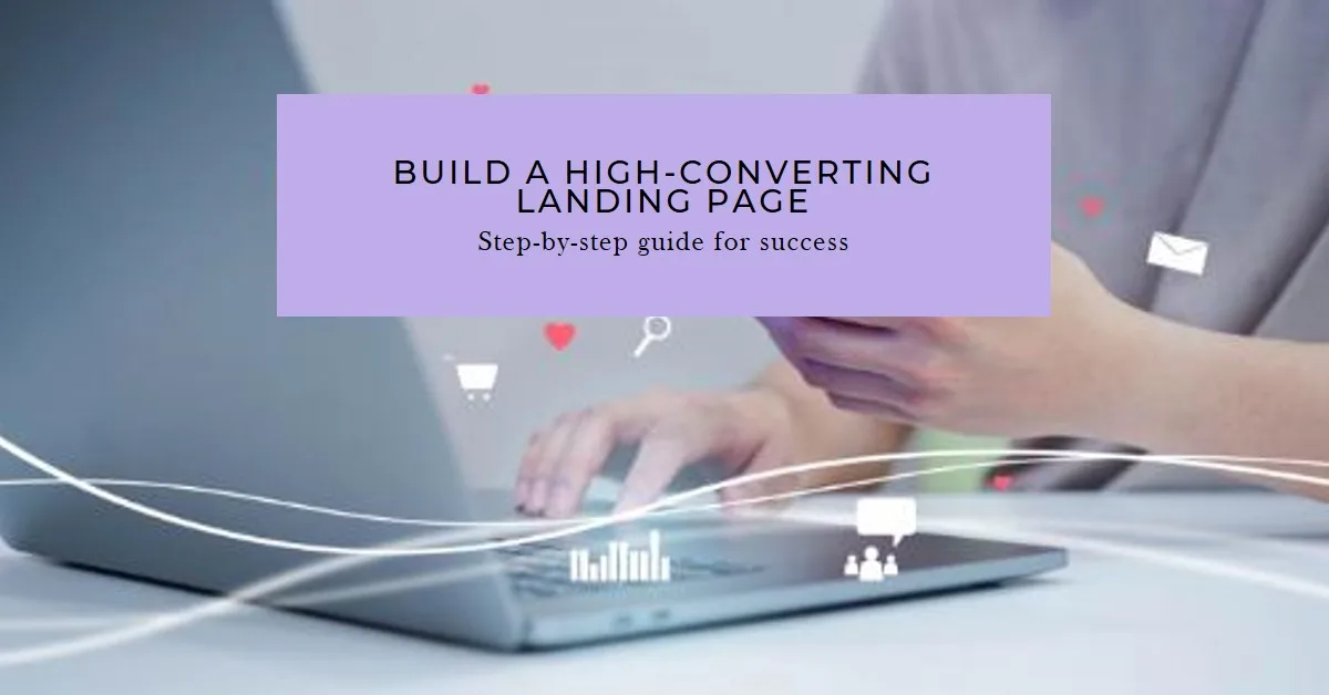
The landing page is the most critical part of your website because it directly influences your results. It turns visitors into subscribers, leads, and customers, making it essential to understand the exact steps for building a high-converting landing page. Knowing this skill is invaluable in today’s digital marketing. A high-conversion landing page is intentionally designed, tested with data, and continuously refined. Whether selling a product, growing an email list, or promoting a service, the success of your landing page hinges on its quality. This guide walks you through each step — clearly, simply, and in the right order-to help you master this vital skill.
What Is a High-Conversion Landing Page?
A landing page is a standalone web page with a single goal. It is built to get visitors to take one specific action. That action could be subscribing to a newsletter, downloading a free guide, booking a call, or buying a product. Unlike a homepage, a landing page removes distractions. There is no navigation menu pulling visitors away. There are no links to unrelated pages—everything on the page points to a single outcome.
Conversion rate is the percentage of visitors who complete the desired action. The average landing page converts at around 2–5%. A high-conversion landing page can convert at 10%, 20%, or even higher. The difference comes down to strategy, design, and copywriting. Understanding this from the start helps you approach the build with the right mindset. Every element on your page either helps or hurts conversion. Nothing should be neutral.
Step 1: Define Your Single Goal Before You Build Anything
The first step is clarity. Before you write a single word or choose a colour, you must define exactly what you want your visitor to do. It is your conversion goal. It must be one thing and one thing only. Common goals include joining an email list, purchasing a product, registering for a webinar, or requesting a free quote. Clarifying this goal helps your audience feel confident that their needs are understood and your page is focused on delivering value.
If you try to achieve multiple goals on one landing page, you will achieve none of them. Multiple calls to action confuse visitors. Confused visitors leave. Decide on your one goal and build everything around it. Write it down in a single sentence: “I want the visitor to click the button and sign up for my free email course.” That sentence becomes your compass. Every decision you make — from your headline to your button colour — should serve that goal and nothing else.
Step 2: Know Your Target Audience Inside and Out
A high-conversion landing page speaks directly to one type of person. It does not try to appeal to everyone. The more specific your message, the more powerfully it connects. Before writing a word of copy, research your target audience thoroughly. Understand their biggest pain points. Know what keeps them awake at night. Identify the language they use to describe their problems.
You can gather this information in several ways. Read reviews of similar products on Amazon or Google. Browse relevant Reddit communities and Facebook groups. Conduct short surveys with your existing audience. The goal is to understand your visitor so well that your landing page feels as if it were written specifically for them. When someone reads your page and thinks, “This is exactly what I need,” your conversion rate soars. Audience research is not optional. It is the foundation on which everything else is built.
Step 3: Write a Headline That Stops People in Their Tracks
Your headline is the single most important element on your landing page. Research consistently shows that most visitors decide within seconds whether to stay or leave. Your headline makes that decision for them. A great headline must do three things: grab attention, communicate the core benefit, and make the visitor want to keep reading.
Focus on the outcome your visitor will receive — not the features you offer. “Lose 10 Pounds in 30 Days Without Giving Up Your Favourite Foods” is more powerful than “Our Nutrition Programme Includes 50 Recipes.” One speaks to desire. The other speaks to features. Always lead with desire. Keep your headline clear and specific. Vague headlines do not convert. Use numbers where possible. Numbers add credibility and set clear expectations. Test different headlines using A/B testing tools. Even a small improvement in your headline can double your conversion rate overnight.
Step 4: Craft a Compelling Subheadline
Your subheadline supports your main headline. It provides a little more detail and reinforces why the visitor should keep reading. Think of it as a bridge between your headline and the rest of your page. A good subheadline expands on the promise made in the headline. It adds context, urgency, or social proof. Keep it to one or two sentences. It should be easy to read at a glance.
For example, if your headline is “Build Your First Website in a Weekend,” your subheadline might be: “No coding experience needed. Our step-by-step system has helped over 10,000 beginners launch their sites in just 48 hours.” That subheadline adds proof, removes a common objection, and reinforces the key benefit. Together, your headline and subheadline should be strong enough to make a visitor want to read every word that follows.
Step 5: Write Persuasive Body Copy That Builds Desire
Your body copy is where you make the case for your offer. It needs to be persuasive without being pushy. The best landing page copy follows a proven structure: identify the problem, agitate the pain, then present your solution as the answer. Start by describing the problem your visitor is facing. Use the language they use. It makes them feel understood. Then explain why the problem matters — what it costs them in time, money, stress, or missed opportunities.
Next, introduce your offer as the solution. Explain clearly what it is, how it works, and what the visitor will get. Use short paragraphs and bullet points to make the copy easy to scan. Most visitors do not read every word. They scan first. If the scanned version is compelling, they go back and read in detail. Use bold text to highlight key points. Write in second person — use “you” and “your” constantly. It keeps the copy personal and direct. Every sentence should earn its place. If a sentence does not help the conversion, cut it.
Step 6: Use Social Proof to Build Trust
People trust other people more than they trust brands. Social proof is one of the most powerful conversion tools available. It shows visitors that real people have used your offer and benefited from it. There are several types of social proof you can use on a high-conversion landing page.
Testimonials are the most common. Use real quotes from real customers. Include their full name, photo, and — if relevant — their job title or location. Specific testimonials convert better than vague ones. “This course helped me get my first freelance client within two weeks” is far stronger than “Great course, highly recommend.” Case studies, star ratings, media mentions, and trust badges all serve the same purpose. They reduce the risk the visitor feels. The more trust you build, the higher your conversion rate climbs. Place social proof close to your call to action for maximum impact.
Step 7: Create an Irresistible Call to Action
Your call to action (CTA) is the button or link that completes the conversion. It is the most critical element on your landing page. A weak CTA kills an otherwise great page. Your CTA must be clear, specific, and action-oriented. Avoid generic button text like “Submit” or “Click Here.” These phrases tell the visitor nothing about what happens next.
Instead, use benefit-driven language. “Get My Free Guide Now,” “Start My 7-Day Free Trial,” or “Book My Free Strategy Call” all tell the visitor exactly what they will receive. The word “my” is particularly effective — it makes the action feel personal and immediate. Make your CTA button large and visually prominent. Use a contrasting colour that stands out from the rest of your page. Place your CTA above the fold — meaning visible without scrolling — and repeat it further down the page for longer landing pages. Remove any friction around the button. Do not ask for unnecessary information. The fewer fields a form has, the higher the conversion rate.
Step 8: Optimise Your Page Design for Conversion
Design on a high-conversion landing page is not about looking pretty. It is about guiding the visitor’s eye and removing distractions. Every design decision should serve the conversion goal. Start with a clean, uncluttered layout. Use plenty of white space. White space makes your page easier to read and makes key elements stand out.
Use a clear visual hierarchy. The most important elements — your headline, CTA, and key benefits — should be the largest and most prominent. Use images and videos strategically. A relevant hero image at the top of your page can immediately communicate your offer. A short explainer video can dramatically increase conversions, especially for complex products or services. Make sure your page loads fast. Slow pages kill conversions. Use compressed images and clean code. Every second you reduce load time increases your conversion rate. Always design for mobile first. More than half of all web traffic comes from mobile devices. If your landing page looks broken on a phone, you are losing most of your visitors.
Step 9: Remove Every Possible Distraction
A high-conversion landing page has one job. Anything that pulls the visitor’s attention away from that job must go. It means removing your website’s navigation menu. It means eliminating links to other pages. And it means cutting any content that does not directly support the conversion. Every exit point you remove increases the chances that the visitor completes your desired action.
This principle extends to your form fields. Only ask for the information you absolutely need. If you are collecting email addresses, ask for a first name and email — nothing more. The more you ask for upfront, the more resistance you create. Think about what the visitor is willing to give at this stage of the relationship. You can always collect more information later, once trust has been established. Keep the page focused, streamlined, and purposeful from top to bottom.
Step 10: Add Urgency and Scarcity (When Genuine)
Urgency and scarcity are powerful psychological triggers. They motivate visitors to act now rather than later. “Later” usually means never. If your offer genuinely has a deadline or limited availability, communicate that clearly on your landing page. A countdown timer showing when a discount expires creates real urgency. “Only 12 spots remaining” creates genuine scarcity — if it is true.
The keyword is genuine. Do not fake urgency or scarcity. Visitors see through dishonest tactics immediately. It destroys trust and damages your brand. But when the urgency is real, use it without hesitation. Phrases like “Enrolment closes Friday at midnight” or “This offer is only available for the next 24 hours” are honest, specific, and effective. Pair your urgency message with a strong CTA button for maximum impact. Remind visitors what they stand to lose by waiting, and they are far more likely to act.
Step 11: Test, Measure, and Improve Continuously
Building a high-conversion landing page is not a one-time task. It is an ongoing process of testing and improvement. Even the best marketers in the world do not guess what works — they test it. A/B testing, also known as split testing, is the process of running two versions of your page simultaneously to see which performs better. You can test your headline, CTA button text, hero image, offer, or form length.
Use tools like Google Optimise, Unbounce, or Leadpages to run your tests. Change only one element at a time. If you change multiple things at once, you will not know which change caused the improvement. Track your results in Google Analytics. Monitor your conversion rate, bounce rate, and average time on page. Look for patterns. If visitors are leaving without scrolling past your headline, your headline needs work. If they scroll to the bottom but do not click your CTA, your offer, or any button, your offer or button needs attention. Data-driven improvement is the difference between a good landing page and a great one.
Common Mistakes That Destroy Conversion Rates
Even experienced marketers make mistakes on landing pages. Knowing what to avoid is just as important as knowing what to include. The most damaging mistake is a weak or unclear headline. If visitors do not immediately understand your offer, they leave. Second is having too many calls to action. One CTA wins every time. Multiple CTAs cause confusion and inaction.
Slow page speed is another silent killer. Visitors have no patience for slow-loading pages. Test your speed with Google PageSpeed Insights and fix any issues immediately. Poor mobile design is equally costly. Always preview your page on multiple devices before publishing. Finally, avoid using stock photos of people who look staged and unrelatable. Authentic images — even simple product shots or real team photos — outperform generic stock imagery every time. Fix these common errors and your conversion rate will improve significantly, often without any other changes.
Conclusion: Now You Have the Exact Steps — Use Them
A high-conversion landing page is one of the most powerful assets in your digital marketing toolkit. It works for you around the clock. It turns traffic into tangible results. Now you know the exact steps to build a high-conversion landing page — from defining your goal and researching your audience to writing persuasive copy, designing for conversion, and testing your results continuously. The difference between a landing page that converts at 2% and one that converts at 15% is not luck. It is strategy, clarity, and relentless improvement.
Start today. Pick one step from this guide and take action on it right now. Build your page piece by piece. Test it. Improve it. Every small improvement adds up to a dramatic increase in results over time. Your landing page is waiting to be great. You now have everything you need to make it happen.
Disclaimer:
This article is for informational and educational purposes only. Results in internet marketing vary based on effort, niche, budget, and consistency. Always conduct your own research before investing in any marketing tool or strategy.
Affiliate Links:
Some links in this article may be affiliate links, meaning they could generate compensation to us without any additional cost to you, should you choose to purchase a paid plan. These are products we have personally used and confidently endorse. Please note that this website does not provide financial advice or investment recommendations. You can review our affiliate disclosure in our privacy policy for more information.